Inside the mind of Midnet Media.

Effective Social Media Strategies for Engaging Audiences In today's digital landscape, social media has become a cornerstone for businesses and organizations looking to connect with their audiences. With billions of users active on platforms like Facebook, Instagram, Twitter, and LinkedIn, the potential for engagement is immense. However, with this potential comes the challenge of standing out in a crowded space. Here are some effective social media strategies to help you engage your audience meaningfully and maximize your online presence. 1. Define Your Target Audience Understanding who your audience is crucial for crafting content that resonates. Develop detailed buyer personas by considering demographics, interests, and online behaviors. This knowledge will guide your content creation, ensuring it addresses the needs and preferences of your audience. 2. Create Valuable and Shareable Content Content is king, but it must be valuable to your audience. Aim to provide insights, entertainment, or solutions to problems they face. Use a mix of formats—videos, infographics, blogs, and images—to cater to different preferences. Don’t forget to encourage sharing by creating content that’s easily shareable, such as listicles, how-tos, and inspirational quotes. 3. Leverage Storytelling Humans are wired to connect through stories. Share your brand’s story, customer testimonials, or case studies to create emotional connections. Authentic storytelling can foster trust and loyalty, making your audience feel like they are part of your journey. 4. Engage with Your Audience Social media is a two-way street. Respond to comments, messages, and mentions promptly. Ask questions and encourage discussions to foster a sense of community. Use polls and surveys to invite feedback, showing that you value your audience’s opinions. 5. Utilize Hashtags Strategically Hashtags can expand your reach and visibility. Research relevant hashtags in your industry and create branded hashtags to build community around your content. Don’t overdo it; a few well-chosen hashtags are often more effective than a long list. 6. Post Consistently and at Optimal Times Consistency is key to keeping your audience engaged. Develop a content calendar to plan your posts and maintain a regular schedule. Use analytics tools to identify when your audience is most active and schedule your posts accordingly to maximize visibility. 7. Monitor and Analyze Performance Regularly analyze your social media metrics to understand what’s working and what isn’t. Track engagement rates, reach, and audience growth. Use this data to refine your strategies and focus on content types and topics that resonate best with your audience. 8. Collaborate with Influencers Influencer marketing can be an effective way to reach new audiences. Collaborate with influencers whose values align with your brand to amplify your message. This can introduce your brand to their followers and build credibility through trusted voices. 9. Utilize Paid Advertising Organic reach can be limited, especially on platforms like Facebook. Consider investing in paid advertising to boost your posts and target specific demographics. Use A/B testing to optimize your ads and ensure you’re getting the best return on investment. 10. Stay Authentic and Transparent In an era where consumers value authenticity, being transparent about your practices and values can set you apart. Share behind-the-scenes content, company culture, and challenges you face. This openness can deepen the trust and connection between you and your audience. Conclusion Implementing effective social media strategies can significantly enhance your ability to engage and connect with your audience. By understanding their needs, creating valuable content, and fostering genuine interactions, you can build a loyal community around your brand. Remember, social media is not just about promotion; it’s about creating relationships that matter. Embrace these best practices to maximize your social media presence and watch your engagement soar!

Case Study: The Rise of Minster Oktoberfest's Online Presence As our community puts a bow on this year's Minster Oktoberfest, we wanted to take a moment to highlight a fascinating case study on the website, minsteroktoberfest.com. Tracking its traffic leading up to the event reveals valuable insights into digital engagement and the effectiveness of event marketing. A Closer Look at the Numbers In the 30 days surrounding Minster Oktoberfest, the website experienced a significant surge in visits. Here’s a breakdown of the impressive stats: Total Visits: The site garnered 33.6k visits in the month leading up to the event. Early September Activity: Around September 1st, the site had a modest average of 500 views per day. End of September Surge: By the end of September, daily views jumped to an average of 1,600, signaling growing interest. Peak Traffic: During the prime days of Oktoberfest week/weekend, daily views soared to an impressive 6,000. Mobile vs. Desktop Growth The increase in traffic wasn’t just notable in total visits; it also highlighted a shift in how users accessed the site: Mobile Visits: There was a staggering 378.7% increase in mobile visits, reflecting the growing trend of users accessing information on their phones. Desktop Visits: Desktop visits also saw significant growth, up by 251.7%, showcasing that both platforms are important for engaging audiences. What Contributed to the Surge? Several factors likely contributed to this dramatic increase in website traffic: 1. Effective Marketing Campaigns: As event promotions ramped up, marketing efforts across social media, email newsletters, and local advertising likely drove more traffic to the site. 2. Engaging Content: Regular updates, engaging content, and event highlights may have kept potential attendees returning to the site for more information. 3. User-Friendly Design: A well-structured website that provides easy navigation and accessibility encourages visitors to explore more and share with others. 4. Community Engagement: As a community-focused event, local engagement and word-of-mouth likely played a significant role in boosting online interest. Conclusion The case of minsteroktoberfest.com serves as an excellent example of how effective digital strategies can significantly enhance engagement leading up to a major event. Tracking these trends not only showcases the event's popularity but also emphasizes the importance of a strong online presence for cultural events. As we continue to be involved with projects like this, we’re excited to see how digital engagement will evolve in the future. If your organization is looking to enhance its online footprint, let’s connect and explore the possibilities together!

Transforming Digital Experiences: Armstrong Air & Space Museum's Website At Midnet Media, we believe that a strong online presence is crucial for cultural institutions to connect with their communities and share their stories. That's why we are excited to showcase our latest project: the newly revamped website for the Armstrong Air & Space Museum. This partnership not only highlights our commitment to enhancing digital experiences but also underscores the importance of making history accessible to everyone. A Fresh Look for a Rich History The Armstrong Air & Space Museum, dedicated to preserving and celebrating the life of the legendary astronaut Neil Armstrong, needed a website that reflected its rich heritage while being user-friendly and visually appealing. Our goal was to create a digital space that invites visitors to explore Armstrong's incredible journey from small-town Ohio to the moon. Key Features of the New Website 1. **User-Centric Design** We prioritized an intuitive layout that allows visitors to easily navigate through various sections, including exhibits, educational resources, and event information. The design incorporates visually engaging elements that draw users in while providing a seamless browsing experience. 2. **Responsive and Accessible** With more people accessing websites from mobile devices, we ensured the Armstrong Air & Space Museum's site is fully responsive. Our team implemented accessibility features to ensure that everyone can enjoy the content and resources available. 3. **Interactive Exhibits** One of the standout features of the new site is the interactive exhibits section. Users can explore Neil Armstrong's life through engaging multimedia presentations, videos, and photographs that bring his story to life. 4. **Event Calendar** The museum hosts a variety of events throughout the year, from lectures to community gatherings. Our integrated event calendar makes it easy for visitors to stay informed and participate in the museum’s offerings. Collaboration and Feedback Working closely with the team at the Armstrong Air & Space Museum was a rewarding experience. Their passion for education and community engagement inspired our design choices and content strategies. Throughout the development process, we prioritized open communication and feedback, ensuring that the final product truly reflects the museum's mission. The Impact of the New Website Since the launch of the new Armstrong Museum website, early feedback has been overwhelmingly positive. Visitors appreciate the modern aesthetic and ease of navigation, and the museum staff is excited about the increased engagement and accessibility. This project has not only enhanced the museum’s digital footprint but also strengthened its connection to the community and beyond. Looking Ahead At Midnet Media, we are proud to have played a part in this transformative project. The Armstrong Air & Space Museum’s new website is just one example of how we strive to elevate cultural institutions through innovative digital solutions. We look forward to continuing our work with the museum and other organizations dedicated to preserving history and fostering education. If your institution is ready to enhance its digital presence, we invite you to reach out to us. Let’s create something remarkable together!

This month we are featuring the employee spotlight on one of the talented graphic designers at Midnet.
Meet: Carly Caywood
Carly is going into her Junior year at Bowling Green State University, studying Graphic Design. When thinking about future career choices, she knew she wanted to do something where she could create something every day.

This month we are featuring the employee spotlight on our Multimedia Director at Midnet.
Meet: Curt Albers

This month we are featuring the employee spotlight on one of our web developers at Midnet.
Meet: Evan Prenger
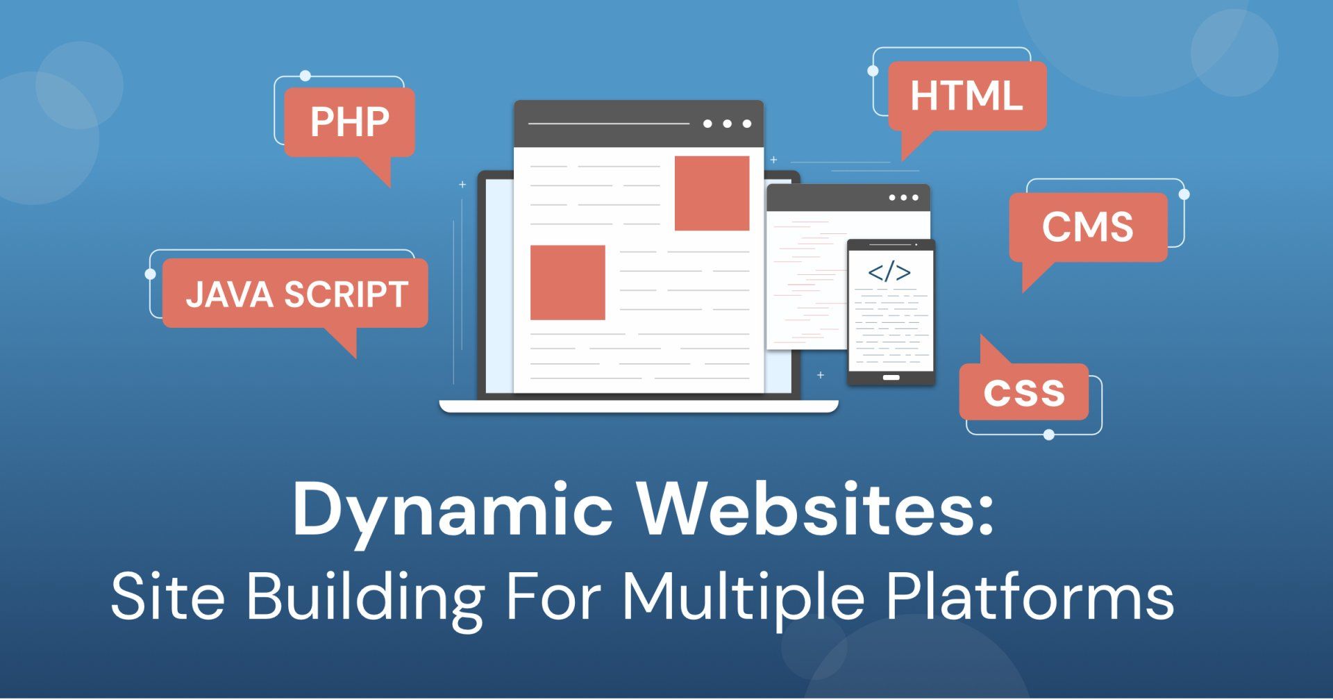
A website can be an exceptional tool for reaching your audience and customers. That is a well-known fact. But, when you’re thinking about building a site, it can be less clear where to start. Sure, you can throw some HTML on a page, upload it to a hosting service, and call it a day. But building a site from scratch is undoubtedly the most time consuming and involved way to make your vision a reality. Fortunately, there are many alternative ways to avoid this path in the year 2021. Throughout the past twenty years, many new CMSs have appeared offering a variety of platforms which can be used as a foundation for a website. A CMS, or a Content Management System, offers an easier and more user-friendly experience for those who have little time to learn web development while still wanting to make changes to their site. However, not all CMSs are created equal, often going about similar functionality in different ways or providing a different range of functionality altogether. In this article, we’ll highlight some of the most prominent platforms we use to make sites and what goes into choosing the right CMS for the job. The three CMSs we’ll be highlighting are Drupal 8, Duda, and WordPress, all viable options for creating a website but rather different in their approaches. WordPress is undoubtedly the most popular platform used today with an estimated 61.8% of the market share of all CMSs while powering over 27 million active websites. That’s over 36% of all websites on the internet whether they use a CMS or not. Wordpress is a great option for someone who wants to get started quickly and without much of a headache or learning curve while offering a large selection of expandability options. However, it is important to mention early on that there are two separate ways to enjoy WordPress’s functionality. Although it appears to be the better and more attractive option, we suggest forgoing WordPress.com in favor of WordPress.org. The primary difference between the two is the level of control you’ll have over your site. Although WordPress.com seems more accessible at first, allowing its users to go in and create a site for free, you will find major limitations in monetizing, hosting, and theming your site. Your website will also technically be a subdomain of WordPress.com and will be locked in to using WordPress’s hosting plans which can lock core features like Google Analytics behind a higher pay wall. Although WordPress.com might be better for more temporary site needs such as school projects, for our purposes today, we’ll be focusing on the .org solution as it really offers the better WordPress experience. So what makes WordPress stand out among the competition? WordPress’s core strengths fall on its swift setup process and its easy accessibility. Getting started with WordPress is a breeze especially seeing as some web hosts (such as Hostgator) come with the built in functionality to setup a WordPress environment with one click. Once that is done, users can easily choose pre-built themes and add pages to their heart's content. Where it gets a bit trickier is when you want to expand the functionality and performance of your site. To expand your site’s functionality, you must select plugins which can be varied in their presentation, price, and stability. There is a huge selection of tried-and-true solutions for common needs, but many plugins have been discontinued, and the rest may leave you with frequent updates that may add additional work for your team. WordPress’s plug-in system can be quite useful, but it is also sometimes hard to separate out the good from the bad and can sometimes lead to unexpected results. This plugin aspect can require a bit of research, but ultimately, they’re pretty easy to add to the site, and just as easy to remove if you find you would prefer something else. Furthermore, because WordPress is so popular, that also makes it the biggest target for exploiters whether that means spam or a full site-wide hack. The latter is rare, but it's good to keep in mind that WordPress’s popularity can be a double-edged sword. Additionally, WordPress can be a tad heavy to load which results in slower page speeds and potential downtime. It also falls short in SEO functionality. Although its Search Engine Optimization methods are easy to use, the options available don’t allow as much potentiel for search engine dominance as some other site building methods might provide. All in all, the WordPress experience can be a solid choice if you want an easy to use and inexpensive website with a large range of improvements at your disposal. However, it is good to keep in mind that it can fall short in other important functions like fast page speed, search engine optimization, and advanced security measures. Similarly, our second CMS, Duda, also boasts simplicity at the expense of depth and creative freedom. Duda is quite new compared to WordPress’s 17 year long run. Duda only released in 2019 but is quickly becoming one of the fastest ways to set up a website. Duda sets itself apart from WordPress with a streamlined drag-and-drop interface and preconfigured section layouts that allow users to quickly and easily create an attractive website at the expense of more complex customization options. That doesn’t mean Duda isn’t powerful though. Unlike similar drag-and-drop site builders like Weebly or Wix, Duda offers a range of advanced functionality that really puts it in a unique position. It boasts a more user-friendly interface with a less-steep learning curve than WordPress while lacking in an over-abundance of extended functionality options. One of the essential differences for quick site-building comes from the fact that Duda doesn’t require a second webpage to view your changes, while WordPress does. This extra step of switching pages and refreshing to preview changes can add a lot of time when building out a website. Additionally, Duda and WP both offer similar functionality in the way of content blocks where you can add a preconfigured set of fields to a section in a defined layout. However, Duda’s widget system is better thought out for aesthetic and usability purposes and adds a lot of useful features from the get go. It also gives you access to create your own widgets in a way that isn’t as difficult or time consuming. This is possible by switching to Duda’s developer mode, which trades the Drag and Drop interface for a more customizable code-based layout. One of the drawbacks of Duda, though, is its pricing model. While both WordPress.org and Drupal are open-source and allow you to use nearly any hosting service, Duda comes with a subscription plan starting at $14 a month. However, this gives you complimentary access to AWS (Amazon Web Services) hosting, which means you won’t have to pay for a hosting service to get your site online. AWS is among the top hosting options though, so the trade off may be worth it for the ease of use and time saved. Marrying simplicity, efficiency, and potentiel functionality, Duda is quickly becoming an avid competitor with other top-name platforms. If you just need a simple site to display information and you aren’t a web developer, Duda should be a strong option to consider. This is not to say it can’t compete in terms of advanced functionality like payment gateways or email handling, but there will be less resources out there to assist you due largely to Duda’s “new kid on the block” nature. Finally, we come to Drupal, another veteran of the CMS market. Drupal has been around since January of 2001 and has since seen a lot of success in building sites with more in-depth needs such as Nasa, Tesla, and the Australian Government who all use Drupal for their websites. If Duda is the king of simplicity, then Drupal gets the crown for functionality. Not only does it come out of the box with a light weight design that outperforms WordPress’s page speed and SEO needs, it also boasts many features such as Webforms that allow you to create easy Contact Us forms with a lot of customizable options through visual editors. Its streamlined menu system adds a range of easy-to-access customization without having to write any code. However, basic web coding knowledge is definitely recommended if you’re going to build a site with Drupal. It has a steeper learning curve, and is more geared towards developers as far as building the layout of the site. Unlike the other two which come with pre-configured themes that make aesthetics easy, Drupal has more of a blank page approach to its visuals and allows the site editors to flesh out the details through traditional web development practices such as using CSS for styling. Drupal also has themes, but they are more of a base on which to build your own custom theme as opposed to a rigid structure that you must work within. Some themes come with simplified coding terms, such as UIkit, which takes common website needs (such as a sliding banner or image gallery) and makes them easier to code and customize. Drupal themes can be a double edged sword though, as you are given greater access to how the site functions while having to spend more time setting things up. However, once your Drupal site is configured and looking good, content editors can easily go in and add content without much trouble. Drupal makes back-end editing complex while making front-end tasks seamless. It also takes a scalable approach to page content compared to Duda’s more rigid Widgets and Wordpress’s Blocks, which means non-developers won’t have to go in and change how things work just to add content or images. With Drupal, you can do functions like pulling content from other pages to display them in a section with a huge list of results programmatically. An example would be if you wanted to pull all blog photos into an image gallery, then you can do that. Drupal has a smarter-not-harder approach to web development that allows you to build your site in a way that is truly unique to your needs. Did we mention it was free? Unlike Duda, there is no subscription fee to get a better product, and the Module system Drupal utilizes is also free and open-source. This means you’ll almost never have to worry about paying more to get expanded features. However, the difference may be limited by the time and knowledge it takes to build out the site properly. You may have to hire some developers at the offset, but, once the site is created, it's largely smooth sailing. Wordpress and Duda might be easier to build out of the box, but if you want a site done right and have a lot of specific ideas in mind for form and/or functionality, Drupal will definitely get you a lot closer than many other options (and will perform better doing it). All in all, we recommend that you research these CMS options for yourself, as there isn’t really a one-size-fits-all solution to every need. Drupal will offer you functionality and creative freedom, while Duda will excel at simplicity and quicker build times. Wordpress is somewhat a blend of both options as it wields some of the simplicity of Duda but also harnesses some of the experience and extended functionality of Drupal. In a sense, they will all be able to fulfill most website needs, but there is a choice to be made between ease of use and complexity of customization. Ultimately, it is important to gauge what needs your site will have, so you can choose the option that is right for you.
In today’s technology scene, mobile devices are becoming an ever more popular way to browse the web, and why wouldn’t they be? Being able to browse the internet at any time and from anywhere without having to worry about a full-sized computer is incredibly convenient. However, there are still many websites out there today that are not optimized for mobile visitors. This can be a lost opportunity. When a mobile user visits a site that has not taken mobile devices into account, they can run into all kinds of problems. Users might have to scroll horizontally to see the entire page, or images and words can get crushed together, get cutoff, or be completely inaccessible. In essence, the non-mobile friendly user experience can make a website aesthetically displeasing and difficult to work with. Non-optimization can even knock a website down in SEO rankings like on the Google search platform. What has been proven effective time after time is a clean design and a clear delivery of information for all screen sizes. So how do websites and web developers plan for mobile interactions? They put additional effort into styling for different use cases. At Midnet Media, for example, we often use Drupal 8 as the foundation for our websites along with a theme called UIkit which helps to simplify many common web building functions including those which help with responsive web design. Using UIkit’s library of classes , Midnet can simply add these terms into the code to create certain behaviors. For example, uk-visible and uk-hidden are two classes we often use together in responsifying a web page for different sizes. When we add the class uk-visible@m to a section, this means that the section will disappear when a browsing window is under 50% width but will reappear when the window width is over 50%. Using this method, we can add uk-hidden@m on a separate section, so that one disappears at the same time as the other section appears. This allows us a great range of functionality to optimize for different screen sizes independently from other screen sizes. However, knowing that UI Kit is not the norm, site builders can achieve similar results as uk-hidden/visible by setting up media queries in their site’s CSS file. Setting the display attribute to “none” or “block” dependent on the width of the screen makes it really easy to optimize sections for different screen sizes. Similarly, you can also use media queries to generate dynamic widths for your elements. One of the key reasons websites aren’t responsive is because they don’t use widths that are a percentage of the section size and instead use static widths that will always take up the same number of pixels. However, in UIkit, we have a way of quickly creating dynamic widths through the uk-width class where we can write “uk-width-1-2” as the class to make our section render at 50% width of the section it is in. Using the CSS property, flex, in the parent element allows us to create side-by-side sections that we can easily size. Say we have an image gallery, and we want the images to be 3 wide when the screen is large, 2 wide when it is under half width, and a single stacked column when the screen size is at the smallest quartile. We would add uk-flex to the section along with uk-child-width-1-3@m, uk-child-width-1-2@s, and uk-child-width-1-1. This means that every child of this section will be 1/3 the width at medium, 1/2 over small but under medium, and full width when at the smallest size. This allows sections to be efficiently stacked so that images, words, and sections are always the proper size for visibility and functionality. Ultimately, swapping out sections and making your widths dynamic are the two most effective ways to get your website ready for any device. You’ll need both for best results. Having just percentages can be effective, but sometimes this will force side by side sections to squish together horizontally forcing text to overflow or images to shrink beyond optimal visibility. Using the section swapping allows you to go a step further and amend any weirdness that might only occur at one size. Consider what it will take to get your website mobile-friendly. What needs to stack, and what needs to be changed or removed entirely at smaller sizes? A little responsification can go a long way to improving your site’s feel and functionality for all users while making sure your website gives off the best impression possible.

You may be wondering whether or not you should hire someone to help with your new website. With all the “free” website building tools out there now, it can be easy to get lost deciding which website building application you should be using -- if any. And while these applications seem tempting by being advertised as “free,” users of these applications miss out on a lot of needed functionality. They may want and even sometimes be limited to the number of pages you can have on your site. You might possibly come across some websites that do something you think would work well with your website, which is great; but then you’re left wondering how to get that. All these things can be daunting when you’re not familiar with building a website. But when you hire professionals, not only can they help you get what you’re looking for; but they take the stress off your shoulders on making sure it will look good and work properly. Here are some reasons why you should consider giving professional help a chance: Saves You Time Whether you’re just starting a business or have been at it for a while; you have more important things to do than spend all your time worrying about building your own website and making sure it works the way you want. Hiring someone takes that time off your plate and allows you to manage your business while being confident you are getting the site you want and deserve. Help When Things Aren’t Working/Go Wrong So, you built the site yourself, but now something is not working the way it should. Where do you go to fix this? Who do you reach out to? When you hire a professional, you know exactly who to reach out to and have confidence that they know how to fix the issue. There is no guessing game on what “contact” email you should reach out to. Oftentimes you only get access to email support with these “free” site builders. When it comes to your business do you really want to be stuck waiting for a response to not know if they will even help you fix it? Working with professionals gives you a personal contact who you have been working with from the beginning to help you when things are broken. Whether this be an email or a phone number, you know who it’s going to and takes away the guessing game of who is going to help. Access to Expert Advice When you hire someone, you have access to someone who knows what they are doing and can help you get exactly what you are looking for and offer other suggestions along the way. If you don’t know what you want your website to look like it can be difficult starting from a blank canvas on your own. Say you run across something on another website and want to know if it would work for yours, you can ask and have another opinion on things and help getting it done instead of doing guess work on your own. Better Web Security You can rest assured that when you hire someone to help with your site, they are going to take the steps necessary to make sure your information stays safe along with your customers. Nothing’s worse than worrying if important information can get into the hands of the wrong person. When working with someone they want your information just as secure as you. When you have security threats you know you have someone to help you take care of them instead of no one to reach out to.